Welcome to WP BigBang, All-In-One WordPress Solutions

Website for everyone

10 Web Design Trends in 2023 that Will Dominate the Industry

web design trends in 2023

Table of Contents

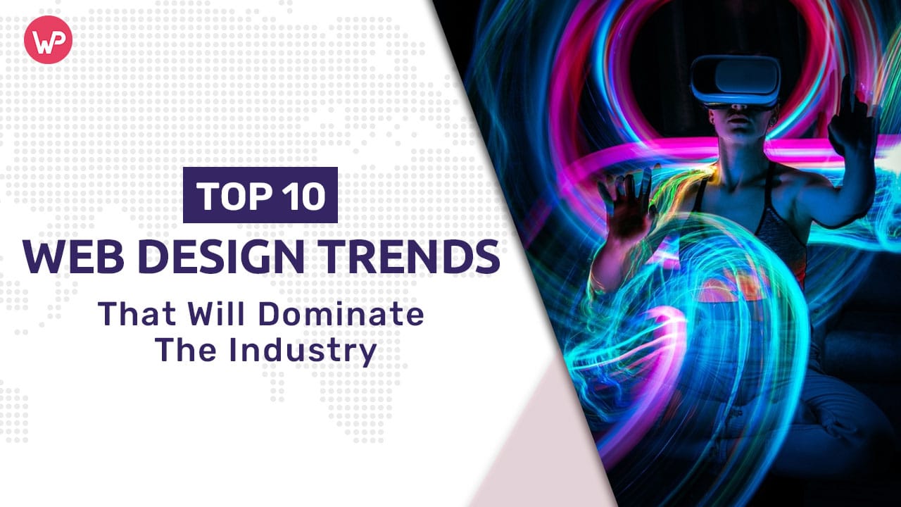
Welcome to the world of web design! As technology advances at an unprecedented rate, web designers are always on the lookout for the latest trends and innovations to stay ahead of the competition. With 2023 just around the corner, it’s time to start thinking about the web design trends that will dominate the industry. Whether you’re a seasoned pro or just starting out in the field, keeping up with these trends will ensure that your designs are fresh, modern, and engaging. In this article, we’ll explore 10 of the most exciting web design trends in 2023 that are sure to make a splash in the industry. So, buckle up and get ready to be inspired!

Brief overview of the current state of the web design industry

Web Design Industry WP BigBang.com - WP BigBang
The web design industry is rapidly evolving and the trend for 2023 is to focus on creating user-friendly, visually appealing, and accessible websites. Designers are opting for minimalism, bold typography, 3D elements, and are incorporating more interactivity. The use of asymmetrical layouts and split-screen designs are becoming popular, and there’s a greater emphasis on mobile responsiveness and site speed. The trend towards personalized, immersive, and emotionally engaging experiences is also growing. Designers are making use of artificial intelligence and chatbots to enhance user interaction. The goal is to provide a seamless and unique experience that delivers a brand’s message effectively.

Importance of staying current with the latest trends in web design

Staying current with the latest trends in web design is essential for businesses to maintain a competitive edge in the market. The industry is constantly evolving, and new design trends emerge every year. In 2023, some of the most significant trends that are expected to dominate the industry include minimalism, 3D graphics, chatbots, artificial intelligence, micro-interactions, immersive multimedia experiences, and more. These trends are expected to transform the way websites are designed and improve user experience, which is crucial for businesses to connect with their target audience. Thus, it is important for businesses to stay updated with these latest trends to keep their websites attractive, user-friendly and appealing to the audience.

Trend 1: 3D and AR/VR Integrations

3D and AR Integrations WP BigBang.com - WP BigBang

“Trend 1” refers to the integration of 3D and AR/VR technologies into various industries. These technologies are becoming increasingly popular and are being used to enhance user experiences and provide more immersive and interactive environments. This trend is expected to continue growing in the coming years as technology advancements make AR/VR more accessible to a wider audience.

Explanation of how 3D and AR/VR are changing the web design landscape.

3D and AR/VR integrations are transforming the web design landscape by adding a new level of interactivity and realism. With the use of 3D graphics, designers are able to create an immersive experience that can be used to showcase products, services, and environments. AR/VR allows users to experience a digital world in a new way and interact with it as if they were actually there. This technology is also being used to create interactive advertisements and e-commerce experiences. As technology improves, these integrations are becoming more accessible, allowing for more creative and innovative solutions for web designers. Overall, 3D and AR/VR are driving the web design landscape forward and changing the way users interact with digital content.

Examples of websites incorporating 3D and AR/VR technologies

  1. IKEA PlaceIKEA Place is a furniture app that allows customers to preview furniture in their homes through AR technology.
  2. Wayfair Wayfair offers 3D room planning and design, which enables customers to visualize furniture in their spaces before purchasing.
  3. The North FaceThe North Face provides a virtual reality shopping experience, allowing customers to explore products in an immersive 3D environment.
  4. Sephora Sephora uses AR technology to provide virtual makeup and beauty consultations for customers.
  5. Houzz Houzz provides 3D modeling services for interior designers and architects. This helps designers to visualize their ideas and get a better sense of the finished space.

These are just a few examples of how 3D and AR/VR technologies are being integrated into e-commerce and retail websites. The trend towards incorporating these technologies is expected to continue as businesses look for innovative ways to engage customers and improve the online shopping experience.

Potential benefits of 3D and AR/VR integrations for website owners and users.

3D and AR/VR integrations have numerous benefits for both website owners and users. For website owners, it enhances the overall user experience and engagement, leading to increased conversion rates and brand loyalty. AR/VR technology also allows website owners to showcase their products in a new and innovative way, allowing customers to interact with and visualize products in a more immersive environment. For users, 3D and AR/VR integrations provide a new level of engagement, allowing them to experience and explore products in a more interactive and personal way.

This technology also enhances the shopping experience, as users can virtually try on clothes, view products from different angles, and see how they fit in their space before purchasing.

Overall, 3D and AR/VR integrations offer a unique and valuable experience for both website owners and users.

Trend 2: Bold and Bright Colors

web design checklist for client
“Trend 2: Bold and Bright Colors” refers to a current design trend where vibrant, eye-catching colors are used in design to make a statement. This trend is often characterized by using a mix of bold hues, like red, yellow, and blue, to create a playful and energetic aesthetic. These colors are often used in web design, graphic design, and product design to add a pop of color and make designs stand out.

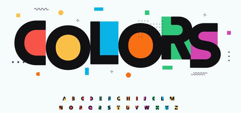
Shift away from minimalistic color palettes

The trend of minimalistic color palettes is slowly giving way to bold and bright colors that pack a punch. This shift is driven by a desire for more individuality and creativity, as well as a need for more energy and excitement in design. Bold and bright colors evoke emotions and create a sense of playfulness, making them popular among designers looking to create memorable experiences for their audiences. Whether it’s through a gradient of neon hues or a single statement shade, bold and bright colors are adding new life to design projects, making them more impactful and eye-catching than ever before.

Increased use of bright and bold colors in web design

The use of bright and bold colors in web design is becoming increasingly popular. This trend is a reaction to the more minimalistic and muted color palettes of recent years. Bright colors are used to capture the attention of visitors and to create a bold, eye-catching design that reflects the brand’s personality and creativity. Brands are using bold colors to stand out in a crowded online marketplace, to convey a sense of energy and excitement, and to evoke emotions and trigger specific responses. Designers are also exploring new ways to use color, such as gradient effects, duotones, and bold contrasts, to create a unique and dynamic visual experience for their users

Explanation of how bold color choices can impact user experience and engagement

Bold and bright color choices can greatly impact user experience and engagement. Bright colors can be eye-catching and draw attention to specific elements on a website or app, increasing engagement and overall user experience. Additionally, certain colors can evoke emotions, such as red being associated with excitement and urgency. By choosing the right color combinations, designers can effectively communicate the desired mood or tone to users. However, too much color can become overwhelming and negatively impact the user experience, so it’s important to find a balance. Overall, bold color choices can greatly enhance the user experience and engagement, as long as they are used thoughtfully and intentionally.

Trend 3: Responsive Illustrations

Responsive Illustrations WP BigBang.com - WP BigBang

“Trend 3: Responsive Illustrations” refers to the growing use of illustrations that dynamically respond and change based on the size and orientation of a user’s device or screen. This trend emphasizes the use of illustrations that enhance the user experience and make a website or app more visually engaging.

Explanation of why illustrations are becoming increasingly popular in web design

Illustrations are becoming increasingly popular in web design due to their ability to enhance the visual appeal of a website, while providing a unique and engaging experience for users. With the rise of responsive design, illustrations are also becoming more accessible, allowing them to adjust dynamically to different screen sizes and resolutions, providing an optimal viewing experience on any device. In addition, illustrations can be used to convey complex ideas and concepts in a more creative and memorable way, making them an effective tool for communication and storytelling. The use of illustrations has become a key component of modern web design and is here to stay.

Overview of how responsive illustrations can enhance user experience on different devices

Responsive illustrations can greatly enhance the user experience on different devices. They are designed to adapt to the screen size and resolution of the device being used, ensuring that the illustrations are always displayed optimally, regardless of whether it is a desktop computer, tablet, or smartphone. This results in a more seamless and visually appealing user experience, as the illustrations will always appear sharp, clear, and correctly sized.

Furthermore, responsive illustrations can be used to create engaging animations, which can help to break up long blocks of text, making the content more appealing and easier to digest. In conclusion, responsive illustrations play an important role in creating an enjoyable and interactive user experience.

Examples of websites using responsive illustrations effectively

Responsive illustrations are becoming increasingly popular as they provide a fun and engaging way to convey information. Some websites that are effectively using this trend include Airbnb, Uber, and Dropbox. Airbnb’s illustrations change in size and style depending on the screen size, creating a cohesive visual experience. Uber’s illustrations are playful and dynamic, creating a fun and memorable brand identity. Dropbox’s illustrations are used to highlight specific features and are resized based on the screen size, making the user experience seamless. These websites effectively use responsive illustrations to create a visually appealing and user-friendly experience for their visitors.

Trend 4: Split-Screen Layouts

Split-screen layouts are a popular design trend where a website or application is divided into two or more sections, each displaying different content. This style is used to showcase multiple pieces of information at once and is particularly useful for comparing and contrasting data. It offers a modern and visually appealing way to present information and can be used to effectively improve user experience.
Split Screen Layouts WP BigBang.com - WP BigBang

Explanation of how split-screen layouts are becoming a popular trend in web design.

Split-screen layouts are becoming a popular trend in web design because they offer a creative and visually appealing way to showcase different types of content on a single page. They allow designers to separate and highlight different sections of a website, such as text and images, making it easier for users to digest the information and navigate the site. Additionally, split-screen layouts can be used to create a sense of balance and symmetry, and can also be used to create a visually appealing transition between sections. As a result, many websites are opting for split-screen layouts to create a more engaging and user-friendly experience for visitors.

Benefits of using split-screen layouts for website owners and users

Split-screen layouts offer a number of benefits for both website owners and users. For website owners, split-screen layouts provide a visually appealing way to showcase multiple pieces of content, while also saving space and improving navigation. For users, split-screen layouts are easy to use and provide a clear and concise way to view multiple pieces of content. In addition, split-screen layouts can help users quickly and easily compare different products or services, making them ideal for e-commerce websites. Overall, split-screen layouts offer a convenient, effective, and engaging way to present information, making them a valuable tool for website owners and users alike.

Examples of websites using split-screen layouts effectively

Split-screen layouts are becoming increasingly popular as a way to divide information into two or more sections on a single page. This design trend effectively balances visual interest and functionality, making it perfect for websites that want to showcase different types of content in a visually engaging way.

A few examples of websites using split-screen layouts effectively are:

  • Airbnb – to showcase different types of accommodation and experiences
  • Dropbox – to show how its cloud storage platform works
  • Microsoft Surface – to showcase its products and features

Split-screen layouts can be used to display images, videos, and text, making it a versatile design choice that can be customized to fit the needs of any website. By carefully balancing the content on both sides of the split, designers can create a visually appealing and effective online experience.

Trend 5: Micro-Interactions

Micro Interactions WP BigBang.com - WP BigBang

Micro-interactions are small, single-purpose interactions within a larger UI experience, such as liking a post, pull-to-refresh, or adjusting the volume. They are designed to improve user engagement and enhance the overall user experience by providing quick, easily accessible feedback.

Explanation of what micro-interactions are and how they are used in web design

Micro-interactions are small, interactive animations that enhance the user experience in web design. They are used to give feedback to the user and to create a more engaging and dynamic interface. Examples of micro-interactions include hover effects, loading animations, and buttons that change color when clicked. These small interactions can be used to help guide the user and provide cues about what is happening on the page. They are a key aspect of modern web design and help to make websites more engaging, usable, and visually appealing. By using micro-interactions, designers can create a more immersive and memorable experience for users.

Benefits of incorporating micro-interactions into web design

Micro-interactions are small, subtle animations that enhance user experience on websites. Incorporating them into web design can provide several benefits such as improved user engagement, increased user satisfaction, and enhanced visual appeal. Micro-interactions can also help to provide instant feedback to the user, making it easier for them to understand the status of their actions and improving the overall user experience. They can also help to communicate specific actions, such as when a button has been clicked or when a page is loading, which can improve the usability of a website. Ultimately, the use of micro-interactions can help to create a more memorable and enjoyable experience for the user, which can contribute to increased brand loyalty.

Examples of websites using micro-interactions effectively

Micro-interactions are small animations or interactions that provide instant feedback to users, adding a touch of delight to their experience. They are used to enhance the usability of a website by making it more intuitive and engaging. Some examples of websites that use micro-interactions effectively are Dropbox, Airbnb, Slack, and Spotify. For example, when a user hovers over an item in Dropbox, it opens up a preview, and when a user scrolls down on Airbnb, the navigation bar disappears. These subtle animations help create a more enjoyable user experience and make the website more memorable.

Trend 6: Asymmetrical Layouts

Asymmetrical Layouts WP BigBang.com - WP BigBang

“Trend 6: Asymmetrical Layouts” refers to a design trend in which elements are placed unevenly on a page, creating a dynamic and visually interesting composition. This approach breaks away from traditional symmetrical design and adds unique, unpredictable elements to a design.

Explanation of why asymmetrical layouts are becoming a popular trend in web design

Asymmetrical layouts are becoming a popular trend in web design because they add visual interest and break away from the traditional symmetrical layout. Asymmetry creates an eye-catching and dynamic visual effect, leading to increased engagement and user experience. This trend also allows designers to be more creative and flexible in their design choices, as they can place elements in unexpected places, leading to a more unique and personalized design. With the rise of minimalism in web design, asymmetrical layouts provide a way to balance simplicity with visual interest, creating a more dynamic and memorable online presence.

Benefits of using asymmetrical layouts for website owners and users

Asymmetrical layouts are becoming increasingly popular in web design as they offer a unique and visually appealing aesthetic. They break away from the traditional grid-based designs, creating an interesting and dynamic layout that draws attention and helps to engage users. For website owners, asymmetrical layouts can create a fresh, modern look that sets them apart from competitors and helps to build brand recognition. For users, asymmetrical layouts can make navigation easier, as they direct the eye towards the most important elements on the page, while also providing a visually stimulating experience. In short, asymmetrical layouts offer both website owners and users a visually appealing and engaging design that helps to attract and retain users.

Examples of websites using asymmetrical layouts effectively

Asymmetrical layouts are becoming increasingly popular in web design as they break away from traditional symmetrical designs and provide a more visually engaging and dynamic experience for the user. A few examples of websites that use asymmetrical layouts effectively include: Airbnb, Dropbox, and Apple. Airbnb uses a combination of asymmetrical and symmetrical elements in its layout to create an attractive and balanced design. Dropbox employs asymmetrical layouts with large images, clean typography, and a minimalist color palette to create an eye-catching and user-friendly design. Apple’s website uses asymmetrical layouts to showcase its products in an innovative and stylish way. Overall, asymmetrical layouts provide a unique and visually appealing design that sets a website apart from its competitors.

Trend 7: Dark Mode

“Trend 7: Dark Mode” is the latest addition to the list of top 10 web design trends that will dominate the industry in 2023. With the rising popularity of dark mode, web designers are now integrating this feature into their website designs to improve user experience and enhance website aesthetics. Dark mode not only reduces eye strain but also helps in saving battery life, making it a must-have feature for any modern website. From e-commerce to gaming, dark mode is becoming a popular trend that is here to stay, and web designers must keep up with this trend to stay relevant in the industry.
Dark mode WP BigBang.com - WP BigBang

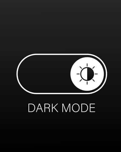
Explanation of the growing trend of dark mode in web design

Dark mode is a growing trend in web design, as more and more websites are incorporating a dark color palette into their design. The dark mode provides a sleek and stylish look, while also providing a more eye-friendly experience for users who spend a lot of time browsing on their devices. It’s also more energy-efficient, especially for devices with OLED screens, which can help extend battery life. Dark mode is also more accessible for people with color blindness or visual impairments, as the high contrast of light text on a dark background makes it easier to read. With its numerous benefits, it’s no surprise that dark mode is quickly becoming a popular trend in web design.

Benefits of using dark mode for website owners and users

Dark mode has become a popular trend in website design and is growing in popularity. For website owners, using dark mode can help reduce eye strain and improve user experience. It also reduces the amount of white light emitted from the screen, making it easier to use the website in low light conditions. Additionally, dark mode can help to save energy, extend battery life, and reduce screen glare, which makes it a more environmentally friendly option. For users, dark mode is easier on the eyes and provides a more immersive experience, making it ideal for long periods of browsing or working. Ultimately, the use of dark mode can lead to increased user engagement and satisfaction, which benefits both website owners and users alike.

Examples of websites using dark mode effectively

Dark mode has become a popular trend among website designs. Dark mode websites offer a sleek and sophisticated look while also reducing eye strain in low light environments. Examples of websites using dark mode effectively include Reddit, YouTube, and Twitter. These websites offer a clear contrast between text and background, making it easier to read in low light conditions. Additionally, dark mode reduces glare and improves battery life on mobile devices. Overall, dark mode adds a touch of elegance and functionality to websites, making it an effective design trend to consider.

Trend 8: Text-based Design

“Trend 8: Text-based Design” refers to a design approach that uses text as the primary element to convey a message. This style is simple and minimalistic, relying on typography and words to create visual interest. This trend is growing in popularity due to the increasing amount of digital content and the need for quick, easy-to-read information.
Text Based Design WP BigBang.com - WP BigBang

Explanation of the increased use of text-based design in web design

Text-based design in web design has become increasingly popular due to the need for clear and concise messaging. This trend emphasizes the use of typography as a key element in design, rather than relying on images or graphics. The use of large, bold typeface combined with minimalistic design helps convey a message effectively and creates a strong visual impact. This trend also caters to the growing trend of mobile browsing, where images may load slower on mobile devices. Text-based design is also more accessible for users with visual impairments, as it provides a clear, easy-to-read experience. Overall, text-based design allows designers to focus on the message they want to convey and create a clean, modern look.

Benefits of using text-based design for website owners and users

Text-based design has numerous benefits for both website owners and users. For website owners, text-based design is a cost-effective way to create an aesthetically pleasing website without the need for graphics or other multimedia elements. Text-based design is also easier to manage and update, making it a more efficient option for busy website owners. For users, text-based design offers a clean and simple experience, making it easier to navigate the website and find the information they need. It also ensures that the website is accessible to all users, including those with visual impairments or slow internet connections. Additionally, text-based design provides a better user experience for mobile devices, as it loads faster and requires less data usage. Overall, text-based design is a versatile and user-friendly option for website owners and users alike.

Examples of websites using text-based design effectively

  1. The New York Times – where the typography and text-based design effectively creates a visual hierarchy, making it easy for readers to navigate and absorb the news.
  2. Medium – where the minimalistic design with a focus on text allows for a clean, easy-to-read platform for articles and blogs.
  3. Dropbox –  where the use of text-based design communicates the brand’s simplicity and focus on efficiency.
  4. A List Apart –  is a design and development website, where the text-based design creates a professional and polished look while also allowing for a functional platform to share articles and tutorials.
  5. AIGA –  is the professional association for design, where the text-based design creates a classic and professional feel while still providing all the necessary information.

Trend 9: Scroll-Triggered Animations

Scroll Triggered Animations WP BigBang.com - WP BigBang
Trend 9: Scroll-Triggered Animations refers to adding movement and animation to a website’s elements as the user scrolls down the page. This adds a dynamic and engaging experience for users while they browse, making the website more memorable.

Explanation of the use of scroll-triggered animations in web design

Scroll-triggered animations are a popular trend in web design that add visual interest and interactivity to websites. These animations are triggered by the user scrolling through the page, and can range from simple fades or slides to more complex motion graphics. They help bring attention to important content, provide context, and create a dynamic user experience. By using scroll-triggered animations, designers can add depth and dimension to their designs, making the user’s experience more engaging and memorable.

Benefits of incorporating scroll-triggered animations into web design

Scroll-triggered animations add a dynamic and interactive element to web design, improving user engagement and making the browsing experience more visually appealing. They also help to grab the user’s attention, guiding them towards important information and calls-to-action. By using scroll-triggered animations, designers can create a more immersive and memorable experience for the user, ultimately leading to better website retention and conversion rates.

Examples of websites using scroll-triggered animations effectively

One example of a website using scroll-triggered animations effectively is Apple’s iPhone 11 Pro website. As you scroll down the page, animations bring attention to the key features of the phone and make the user experience more engaging. Another example is the website for Dropbox’s Paper, where images and illustrations come to life as you scroll, providing an interactive and dynamic experience for the user. These types of animations enhance the overall design and user experience of the website, making it more memorable and impactful.

Trend 10: Minimalism 2.0

Minimalism 2.0 WP BigBang.com - WP BigBang
“Trend 10: Minimalism 2.0” refers to a new version of minimalism that prioritizes simplicity, functionality and sustainability in design, lifestyle and consumption. It involves decluttering, simplifying, and choosing quality over quantity. The focus is on creating an intentional, mindful and environmentally conscious lifestyle.

Explanation of the evolution of minimalism in web design

Minimalism in web design started in the early 2000s as a response to the cluttered and busy websites of the past. It involved using simple designs with clean lines and a focus on user experience. However, minimalism has evolved into “Minimalism 2.0,” where designers are now using more color, graphics, and typography to create a bolder and more visually interesting look. This new trend is also more focused on mobile-first design and responsive layouts. The goal is still to keep designs simple and clean, but now with a greater emphasis on making the website visually appealing and engaging. Overall, Minimalism 2.0 is a modern take on the classic minimalist design approach, incorporating new technologies and design trends while still retaining the simplicity and focus on user experience that made it popular in the first place.

Overview of how minimalism 2.0 differs from traditional minimalism

Minimalism 2.0, also known as “New Minimalism,” is a modern version of the traditional minimalism trend. It focuses on simplicity, functionality, and the elimination of clutter, but with a twist. Unlike traditional minimalism, which is often associated with plain, monochromatic, and sparse spaces, Minimalism 2.0 incorporates bold, bright, and eye-catching accents, patterns, and textures. This new take on minimalism allows for more creativity, while still maintaining the core principles of minimalism, making it a more accessible and appealing trend for a wider range of people.

Examples of websites using minimalism 2.0 effectively

Choosing the right font is crucial in web design because it affects the readability and legibility of your content. A font that is too small or too ornate can make it difficult for the reader to understand the text, resulting in a poor user experience. Additionally, the font you choose should align with your brand style and image. This helps to reinforce your brand identity and creaMinimalism 2.0 is an evolution of the classic minimalism design style, incorporating a more modern and clean aesthetic. This trend emphasizes simplicity and functionality, with a focus on typography and whitespace. Some of the websites that use Minimalism 2.0 effectively include: Airstream, Dropbox, and Airbnb. These websites have a sleek and modern look, with clear and concise messaging, and a minimalist color palette. They rely on large, bold typefaces and ample white space to create a clean and uncluttered user experience. Overall, Minimalism 2.0 provides a visually pleasing and easy-to-use interface that is both modern and timeless.te a consistent visual aesthetic that resonates with your target audience. The right font can enhance the overall look and feel of your website and make it more appealing to users. By taking the time to choose a font that is both easy to read and aligns with your brand, you can create a website that is both functional and aesthetically pleasing.

Final thoughts

Final Thoughts 1.0 WP BigBang.com - WP BigBang
Staying current with the latest trends in web design is crucial for businesses and individuals to remain competitive in today’s digital landscape. The internet is constantly evolving and it’s essential to keep up with these changes to provide a user-friendly, visually appealing and accessible website. Keeping up with current trends helps in improving the user experience, attract new customers, and retain existing ones. Furthermore, staying ahead of the curve also shows that you value innovation, creativity and care about providing the best to your customers. So, it’s essential to stay updated and embrace the latest technologies in web design to achieve success in your online endeavors.

Leave a Reply

Your email address will not be published. Required fields are marked *

Welcome & Thank you for exploring our website.

We appreciate you taking the time to learn about our products and services. Ready to take your digital presence to the next level? Contact us today to see how we can help!

This website uses cookies to ensure you get the best experience on our website, please read our Cookie Policy

WP BigBang Affiliate Program

Interested in earning additional income with us?

WP BigBang’s new affiliate program is just around the corner! Join our affiliate network for 20% lifetime commissions on EVERY project you refer.

Sounds exciting right? Learn more and partner today!

Verified by MonsterInsights